

| Finding Our Colours: How Earthly Comforts Grew Into Its Identity When we first started Earthly Comforts back in October 2022, we mostly thought about tools, timing, seasonal cycles, and how best to help local gardens thrive. What we didn’t realise then was how much thought would eventually go into something softer but surprisingly influential: Our colours. Not just our uniforms or our logo, but the feeling these choices give to the people who see us moving through the streets of Sandwich. Because when you’re a small, eco-conscious gardening business rooted in a historic town, your colours speak for your values. They speak of place. They speak of belonging. As our business and the gardens we tend have grown, so too have our colours, evolving alongside us. |
| What We Want People to Feel When They See Us If we could sum up the feeling we hope to give off, it would be this: “They understand this town and the community. They respect nature. They care for our gardens with heart.” We want to look familiar, trustworthy, steady — part of Sandwich’s natural rhythm rather than a business passing through. Earthly Comforts has always been more about relationships than transactions. So our visual identity had to reflect that warmth and grounding—nothing loud or showy, just settled, reassuring colours and symbols. Nothing loud. Nothing showy. Just colours and symbols that feel settled, reassuring, and honest. |
| Why Standing Out Matters for a Gardening Business (Especially Now) Growing a gardening business has always required professionalism, reliability, and hard work — but with the realities of the 2025 Autumn Budget shaping how small businesses operate, clarity of identity now matters more than ever. Clients are paying more attention. Budgets are tighter. People want confidence in the choices they make. A soft, consistent visual presence helps them feel: “This is a good, steady, eco-minded team I can trust.” Here’s why recognisability matters in 2025 and beyond: Trust is built at a glance Your identity says “we care” before you say a word. Eco-conscious clients look for natural cues Colours reflect values — natural tones signal a natural approach. It protects your business from being mistaken for cut-corner operators Consistency shows professionalism. It reflects pride in the craft A tidy uniform is an extension of a tidy garden bed. It supports fair pricing A strong identity builds confidence in your work. It becomes part of the neighbourhood scenery People trust what they see regularly. Identity is about clarity, warmth, and trust — the foundation of all our client relationships. |
| The Three Ways People Recognise Earthly Comforts As Earthly Comforts has grown, we’ve discovered that our identity is built on three simple but powerful visual anchors, each working together to make us recognisable: our distinctive colours, logo, and community posters. The Colours We Wear Our uniforms are chosen to feel natural, calm, warm, and unmistakably “us.” From burnt oranges and burgundies to khakis and forest greens, they create a soft presence that blends into the landscapes we care for. Our Instantly Recognisable Logo Long before our palette settled into the earthy tones of today, our logo was already becoming familiar. Its warmth, shape, and central glow made it easy to spot on jackets, flyers, barrows, and bikes across Sandwich. It told people: “These are the gardeners who take pride in their work.” Over time, the logo has become part of the town’s visual language — a comfortable, familiar sight that signals care and reliability. Our Community Window Posters Our window posters are the quiet heartbeat of our local presence. Clients who display them do more than support our business — they help weave us into the daily life of Sandwich. Across the town, these posters: create visual continuity spark a conversation between neighbours build trust by association Reinforce that Earthly Comforts is a known and valued service Our colours, logo, and posters together forge a street-level identity rooted in community and trust. |

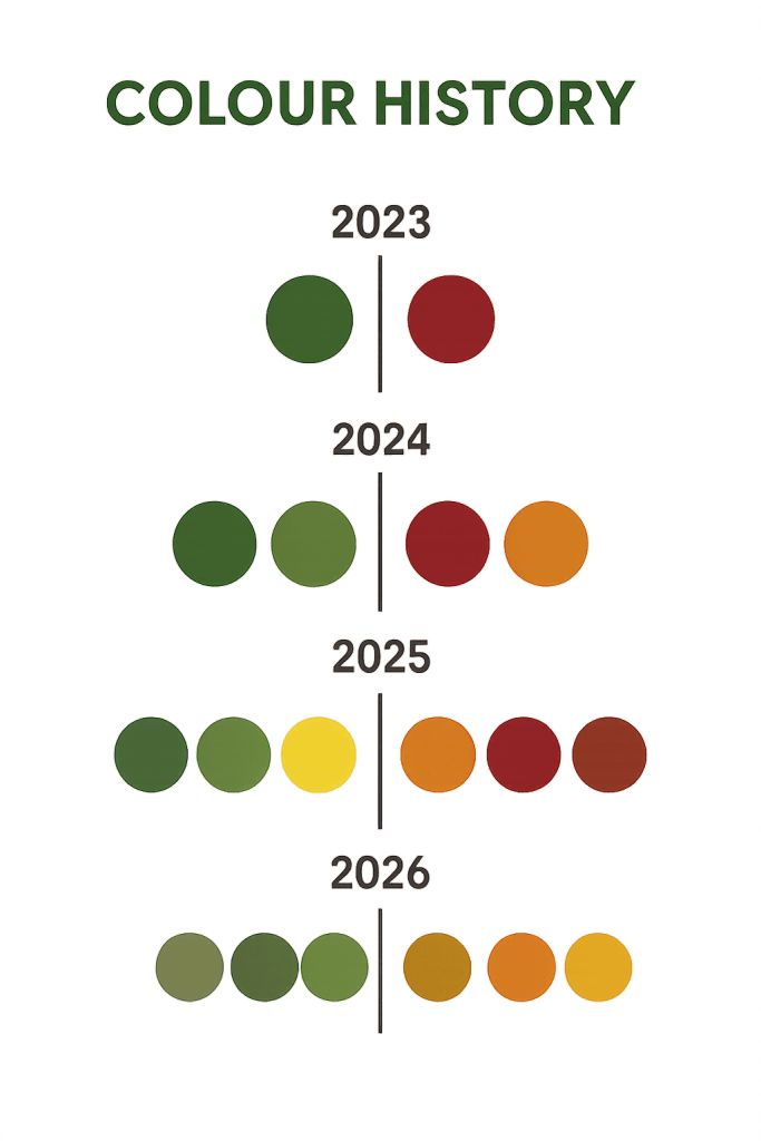
| Our Colour Journey: A Story of Growth (2023 → 2026) Looking back, our colour evolution mirrors our growth as a business and our deepening commitment to eco-friendly gardening. 2023 — The Beginning Bottle Green & Burgundy A classic, reliable start — practical and familiar. 2024 — Warmth and Balance Bottle Green, Burgundy & Khaki Olive & Burnt Orange Orange brought warmth and friendliness into the palette. 2025 — A Year of Experimentation Core: Bottle Green, Burgundy, Burnt Orange Summer Trials: Lime, Sunflower, Black Extra Accents: Mustard, Classic Red, Orange Rust A colourful year where we explored what felt right for us — while navigating the earliest ripples of economic tightening. 2026 — Finding Our True Eco Identity Urban Khaki, Olive, Burnt Orange, Pumpkin Orange These colours finally felt like Earthly Comforts: nature-inspired grounded calm timeless sustainable A palette truly rooted in the landscapes of Sandwich. |
| Our Marketing Colours Matured Too Our earliest marketing materials were bright, bold and enthusiastic — the energy of a new business finding its place. As the business matured, and as sustainability became not only an ethos but a necessity, our visual style naturally softened: muted greens warm neutrals gentle layouts a look that’s easier on the eye and truer to our values Our online presence now feels like an extension of the gardens we care for. |
| A Modern Uniform for a Multi-Role Team As our services expanded into property care and utility tasks, we created a uniform approach that balances consistency with practicality: Gardeners Natural greens, khakis, and beiges — breathable, botanical, eco-aligned. Property & Utility Roles Durable trousers, natural-toned tops, and the same warm, grounded palette. One team. Many skills. Shared identity. |
| Looking Ahead: A Warmer, Kinder, More Sustainable Identity In the wake of the 2025 Autumn Budget, sustainability isn’t just environmentally important — it’s economically wise. Investing in timeless, durable colours and materials supports both our ethos and our future resilience. Our unified identity — colours, logo, posters, tone — gives clients confidence that: We’re here for the long term. We work with care We’re rooted in community. We respect the environment. We value quality and consistency. Earthly Comforts isn’t trying to be the loudest business. We aim to be the warmest, the most grounded, and the most connected to the town we serve. Our colours express our identity: warm, grounded, and connected to Sandwich. Earthly Comforts — Gardening with Heart, Purpose, and Planet in Mind. |

I like the new color palette very much. Personal preference of course for lighter, happier colors. “Earthly Comforts — Gardening with Heart, Purpose, and Planet in Mind” – that’s a nice tagline.
LikeLiked by 1 person
Morning Grace, thank you. The vibrant and energetic colours of 22, 23 and 24 worked well and l think were great for launching, but as we have become more established in the town now, l have seen that there is more support and welcome acceptance of muted colours. I also love the tagline we are currently using. ‘it’s a keeper as they say’.
LikeLiked by 1 person
I love your new ideas, Rory, and the softer colors. The more natural colors are, as you mention – warmer, kinder, and sustainable.
LikeLiked by 1 person
Thanks Eugenia 🙂
LikeLiked by 1 person
You’re welcome, Rory.
LikeLiked by 1 person