| Simplifying Earthly Comforts — From the Website to the Street |
| When you run a small business, you’re tempted to explain everything. You know how much thought goes into the service you provide, how many different situations you can handle, why you work a certain way, and what separates you from someone else offering something similar. Quite naturally, you want prospective clients to understand all of that. The trouble is that, over time, all those perfectly reasonable explanations begin to accumulate. Another service is added, another question answered, another paragraph written and another page created. Eventually, you can find yourself saying so much that the simplest message — what you actually do and why somebody might want you to do it — becomes harder to see. That is something we have been confronting recently at Earthly Comforts. The business itself has continued to evolve, particularly as we have moved from our original Garden Butler roots towards the broader Garden Butler and Estate Butler service we provide today. Gardens remain at the heart of what we do, but clients increasingly ask us to help with other practical aspects of looking after their homes and properties. The business has grown naturally in response to those needs, and our website grew with it. None of the information we added was particularly unnecessary at the time; the problem was that eventually there was too much of it. Curiously, it was not a website redesign that made us recognise this. It was advertising. |
| Finding the Message Again We recently began developing a new generation of local advertising for Earthly Comforts. We never intended to produce another gardening flyer. Plenty of those already exist, often filled with lists of services, telephone numbers, and photographs of lawns or hedge trimmers. We wanted something that felt more like Earthly Comforts: warm, established, horticultural, and recognisably local, while still professional enough to represent the business we have become. That led us to a richer visual identity built around established gardens, mature borders, flowers, wildlife, natural materials, and warm sunlight. The familiar Earthly Comforts greens and creams remain, but they are now accompanied by much more vibrant garden imagery. There is colour, life and a slightly romantic sense of what a well-cared-for garden can feel like. It is not supposed to represent an immaculate show garden that nobody actually lives in. It is intended to evoke a garden that is mature, loved, used and looked after. Out of that process came one remarkably simple line: Your Garden — Cared For Throughout The Seasons. The more we worked with it, the more we realised how much those few words were doing. They say that Earthly Comforts looks after gardens, that our relationship with them is ongoing rather than fleeting, and that care changes as the year changes. They also convey something of the philosophy behind the Garden Butler service without requiring three paragraphs to explain it. That was perhaps the first indication that we could say much less. |

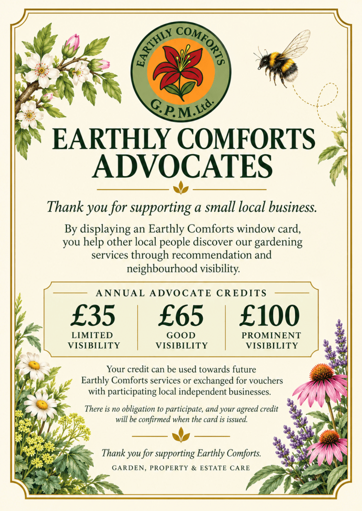
| Starting With the Window One of the first places you’ll see this new approach is in our window advertising. We have developed a smaller [A6], cleaner window card that can sit naturally in a local business or other suitable location without attempting to behave like a miniature brochure. It’s not meant to explain every service Earthly Comforts offers. Its purpose is to catch someone’s eye, establish who we are and give them a simple route to find out more. That sounds almost absurdly obvious on paper, but it is surprisingly difficult when you are responsible for your own advertising. Every empty corner looks like somewhere another useful sentence could go. Every omitted service feels like a potential customer we lost because we didn’t mention it. Before long, a simple advertisement can become a condensed version of an entire website, and the person looking at it has to work far harder than they should. The new window card deliberately resists that. The imagery does much of the initial work, while the wording concentrates on the central Earthly Comforts message. The business identity is clear, the connection to the garden is immediate, and anyone interested in learning more can take the next step. We do not need to tell them everything while they are standing in front of a window. |

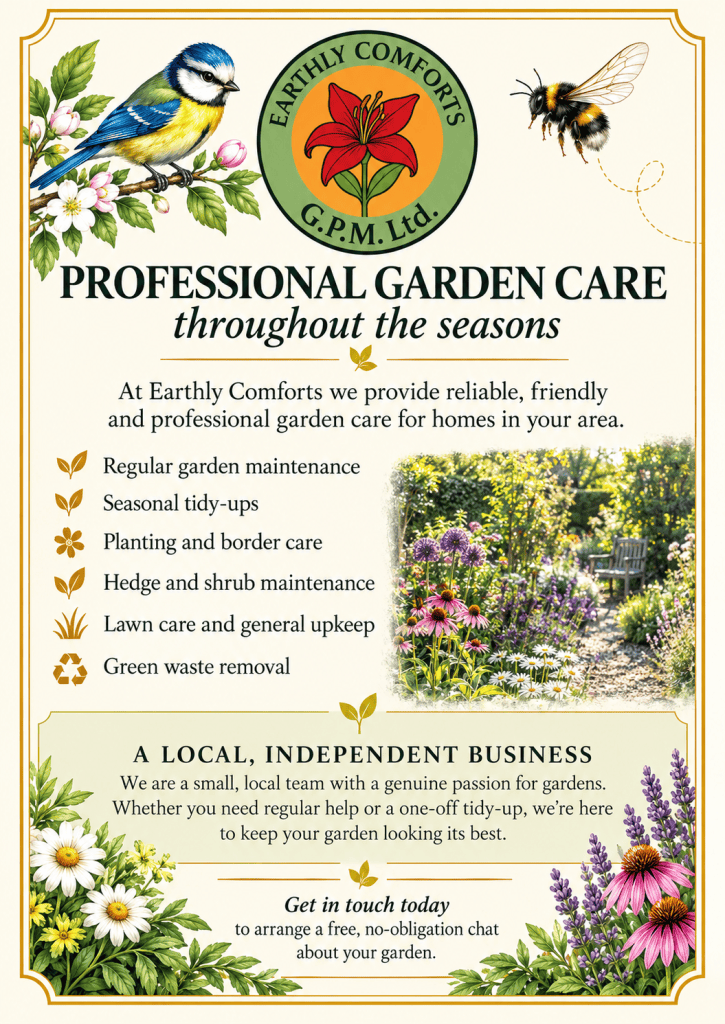
| We’re Gardening in Your Neighbourhood The same thinking has influenced another new piece of advertising: our “We’re Gardening in Your Neighbourhood” card. This came from reconsidering whether conventional leaflet distribution was really the right approach for Earthly Comforts. Rather than sending thousands of general flyers through doors in the hope that a tiny percentage reach somebody looking for a gardener at that moment, we became much more interested in using our existing work geographically. When we regularly care for a garden on a particular road or in a neighbourhood, there is a natural reason to introduce Earthly Comforts to nearby households. People may have already seen our van, noticed us working, or wondered who looks after a particular garden. The neighbourhood card makes that connection without pretending there is already a relationship where there isn’t one. It simply says, in effect, we are already working nearby, and if you need some help with your garden too, here is who we are. That approach also makes sense operationally. A gardening business can lose an extraordinary amount of productive time simply moving between clients. Developing small concentrations of work within the same areas is therefore useful for the business and convenient for clients. It reduces unnecessary travelling, makes scheduling easier and allows more of the working day to be spent actually looking after gardens. The advertising and the practical operation of the business begin to support one another rather than existing as separate ideas. |

| Taking Earthly Comforts Into Print The next stage of the campaign will take the same identity into Sandwich Times, where we have decided to use a landscape half-page advertisement. We initially considered a quarter page, but seeing the different advertising sizes together in the actual publication changed our minds. The half page had far greater presence and, perhaps more importantly, gave the Earthly Comforts design enough room to breathe without filling every available millimetre with information. The plan is to run six advertisements over twelve months, approximately one every two months. We are not planning to reinvent the advertisement for every issue. In fact, the intention is almost the opposite. The same essential advertisement will appear repeatedly so that somebody who encounters Earthly Comforts in the magazine several times begins to recognise it without necessarily having to read it from the beginning each time. That consistency matters. Local advertising is not necessarily about persuading somebody to telephone the first time they see your name. A householder may be perfectly happy with their garden today and need help six months from now. They may notice Earthly Comforts once, recognise it the second time and remember it the third. By repeatedly changing the design to keep each advertisement fresh, we could undermine the familiarity we are trying to build. The magazine advert therefore uses the same visual language as the rest of the campaign: the botanical Earthly Comforts identity, a beautiful established garden, clear contact information and the message Your Garden — Cared For Throughout The Seasons. It also introduces a modest welcome credit for new customers, not as a loud discount promotion but simply as a small encouragement for somebody considering trying the service for the first time. |

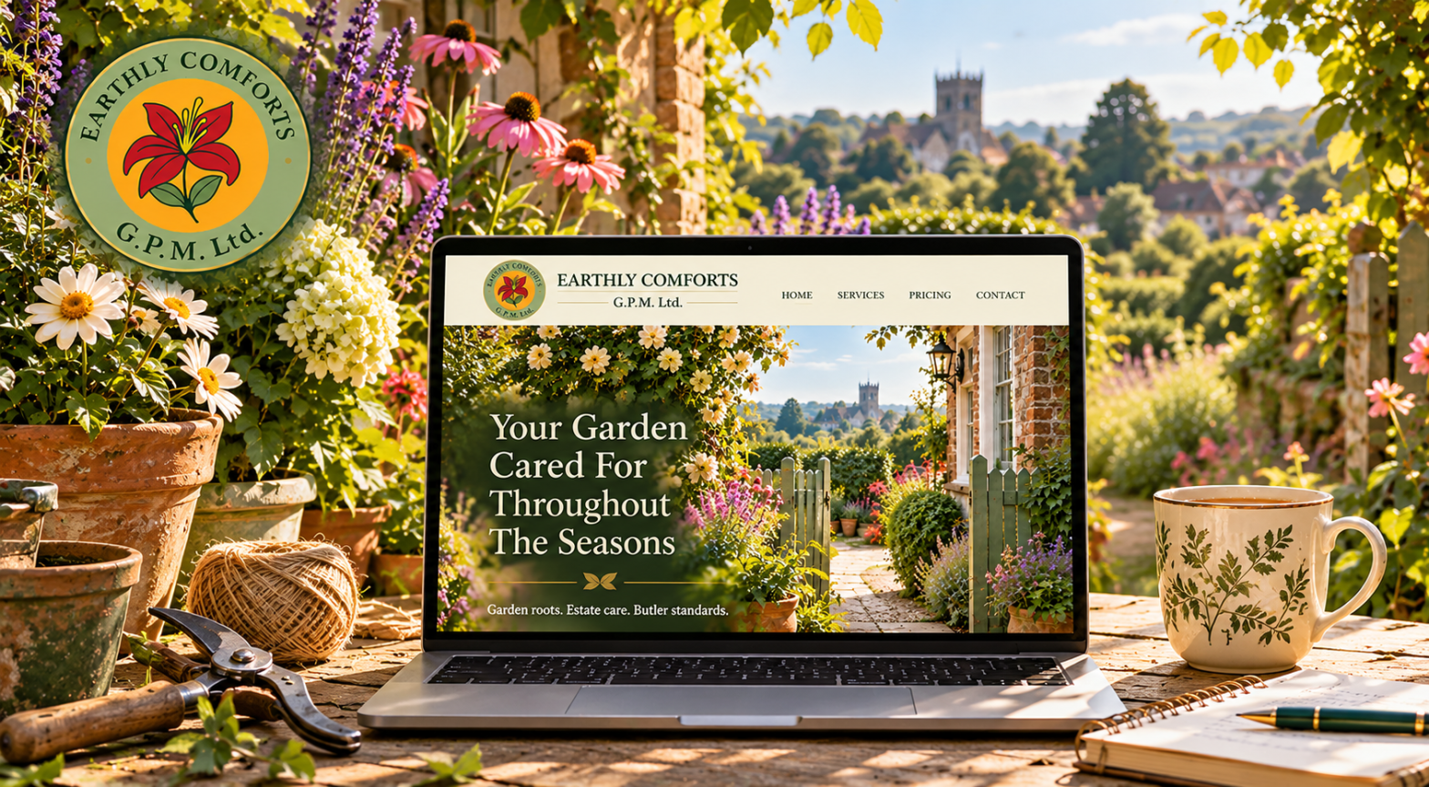
| Then We Looked at the Website Once the advertising settled into this much clearer identity, something rather uncomfortable became obvious. Somebody could see a clean, attractive Earthly Comforts advertisement, scan the QR code, and land on a website with far more information than the ad suggested they needed. The website had grown organically, like the business. We had a Home page, Services, Garden Pricing, Meet the Team, Frequently Asked Questions, and Contact, each with detailed explanations. We explained what an Estate Butler was, why we worked hourly, which villages we covered, who everyone on the team was, how different services operated, and what happened under a variety of circumstances. Much of it was useful information. Taken together, however, it was a lot to ask somebody to absorb just because they were considering getting in touch. So instead of rewriting all six pages, we began removing them. The commercial website has now been reduced to just four principal pages: Home, Services, Pricing and Contact. Two pages — Meet the Team and FAQ — have been removed completely. They haven’t been condensed, renamed or relocated elsewhere; we simply decided they were no longer necessary. Earthly Comforts is a small independent local business, and the character of the people behind it can come through naturally in the way we write and communicate without requiring a collection of individual biographies. The same reasoning applied to the FAQ. Rather than maintaining a separate page of questions and answers, the small amount of information that genuinely matters to a prospective client now sits where it belongs — within Services, Pricing or Contact. Everything else was information somebody could ask us about if and when it became relevant. |
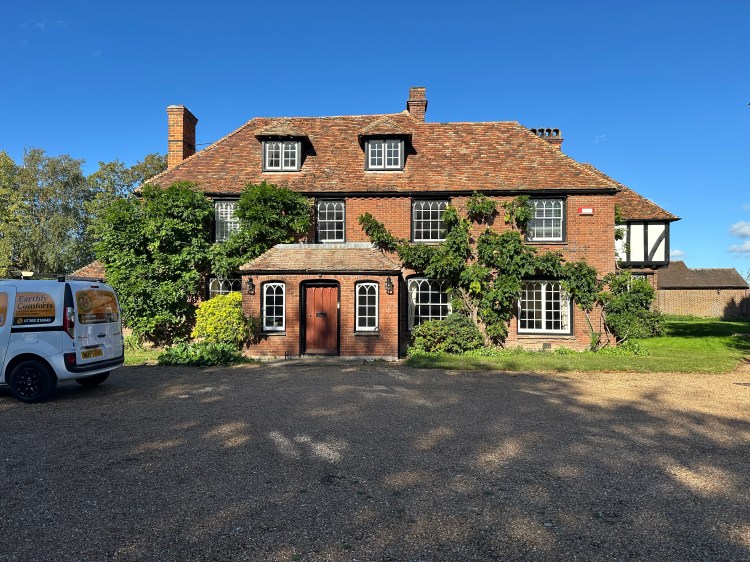
| Let’s not forget the van, which is vibrant as well and is often remarked upon. |
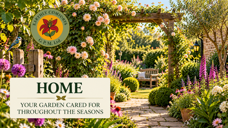
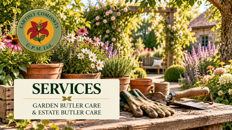
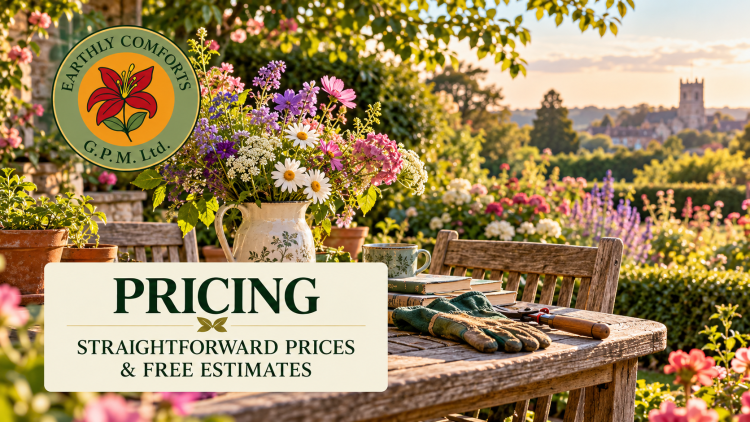
| Keeping What Matters Simplification does not mean stripping Earthly Comforts of what makes it different. In fact, deciding what to remove has made us think rather harder about what absolutely must remain. Our Garden Butler roots matter. The wider Estate Butler service matters. Being independent and local matters. Reliability, consistency and taking responsibility for the places entrusted to us matter. Those ideas aren’t being removed; they are no longer surrounded by so much explanation. One phrase that survived the process particularly well is Garden roots. Estate care. Butler standards. It connects where Earthly Comforts began with what the business has become, while retaining the Butler principle behind both. We don’t use the word Butler to suggest formality. We use it because it describes an attitude toward responsibility: getting to know the places we look after, noticing the small things, being dependable, and taking pride in doing things properly. Even the Pricing page has become part of this simplification. Rather than presenting prospective clients with several different rates and then requiring another section to explain why those rates exist, we’re making public pricing much easier to understand. Our regular Garden Butler rate remains clear, while larger Estate Butler projects and one-off work can be discussed and estimated according to what is actually required. Green-waste arrangements have also been simplified so that routine collections are easier for clients to understand and easier for us to administer. At the same time, we can handle substantial clearances appropriately when they occur. A Prettier Earthly Comforts The visual changes to the website may ultimately be just as noticeable as the reduction in words. We are retaining the sage background that has become part of the site’s identity. Still, each principal page is receiving a new headline image in the same visual style as the advertising campaign. Home opens into a colourful established garden. Services uses a warm potting-table scene with flowers and gardening tools. Pricing has a quieter garden-table setting looking out across a sunlit landscape, while Contact uses an inviting garden gate and path. Even the Newsletter page is being brought into the same family, using garden imagery that immediately identifies it as part of Earthly Comforts. There is something rather satisfying about the fact that the website will contain considerably fewer words while potentially feeling more like Earthly Comforts than it did before. The images now carry some of the atmosphere and personality we previously tried to communicate through paragraphs of text. The words can therefore concentrate on information, while the visual identity does more of the emotional work. One Earthly Comforts, Wherever You Find Us Perhaps the most important outcome of all this is that we have stopped thinking about the website, window card, neighbourhood card and magazine advertisement as separate pieces of marketing. They are different entrances into the same business, and somebody should recognise Earthly Comforts whichever entrance they happen to use first. One person may notice our card in a local window. Another may receive a neighbourhood card because we are already working a few doors away. Somebody else may repeatedly see us while reading Sandwich Times. A recommendation from an existing client may lead another person directly to the website. The route is different, but what they encounter should feel familiar: the same colours, the same garden-led imagery, the same tone and, above all, the same straightforward sense of what Earthly Comforts is. More is happening behind that simple presentation than an advertisement or four-page website could ever show. We care for gardens throughout the year, provide practical support for properties, organise larger projects, get to know clients over time, and the developing Soil Hub explores what can be done with much of the green material our gardening work produces. Those things remain part of the wider Earthly Comforts story, and some of them will continue to be explored through our Journal and Newsletter rather than squeezed into the commercial pages of the website. That may ultimately be the lesson from this particular stage in the development of the business. Not everything we have to say has to be said at once. A prospective client does not need the entire story before deciding whether to pick up the telephone. They need to understand what we do, where we work, what sort of business we are and how to reach us. If they want to know more, there will always be more to discover. It has taken a surprising amount of thought, discussion, design and occasional frustration to arrive at something that looks considerably simpler than what we had before. But perhaps that is exactly what good simplification requires. The objective was never to make Earthly Comforts say less because there is less to say. It was to make sure that what we do say is worth hearing. |

